Use this node from the SDK
Add it in Python with
pipeline.add(name="...").talk(...). See the SDK reference.Core Functionality
- Sends a card component with image, title, description, and action button to the user
- The button supports Link action type, navigating the user to a specified URL when clicked
- Requires a Start node on the canvas to function
- Does not produce outputs — it is a display-only node
Tool Inputs
Title— Text. The card’s title text.Description— Text. The card’s description text.Image— Image. The card’s header image.Content— Text. Additional content text for the card. Default: “This is content”.Button Name— Text. The label displayed on the button. Default: “Submit”.Button URL— Text. The URL to navigate to when the button is clicked. Default: “https://vectorshift.ai/”.Button Action Type— The action to occur when the button is clicked. Default: “Link”.
Tool Outputs
The Card node has no outputs. It is a display-only node.- Workflows
Overview
In workflows, the Card node presents a visually rich component in the chat interface. It combines multiple pieces of information — an image, title, description, and call-to-action button — into a single card that users can interact with. This is ideal for presenting options, showcasing products, or providing structured summaries with actionable links.Use Cases
- Present investment fund options with fund name, description, performance chart, and a “Learn More” link
- Show product recommendations in an e-commerce chatbot with image, name, price, and a “Buy Now” button
- Display a document summary card with a title, brief description, and “Download PDF” button
- Present service tier options (Basic, Professional, Enterprise) with features and pricing links
- Show a contact card for a financial advisor with their photo, name, role, and a “Schedule Meeting” button
How It Works
Step 1: Add a Start Node
The Card node requires a Start node on the canvas.Step 2: Add the Card Node
In the workflow canvas, click the Chat tab, click Talk, then select Card from the variant list.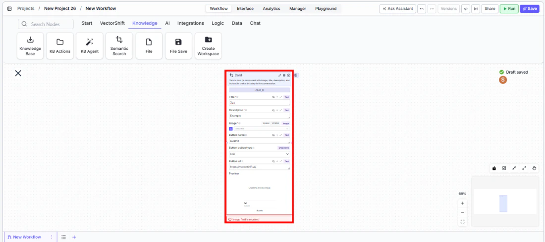
Step 3: Configure the Card Content
Fill in the card fields:Title, Description, Image, and Content. These can be static text or connected from upstream nodes via variables.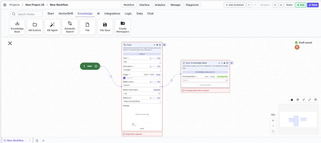
Step 4: Configure the Button
Set theButton Name (label), Button URL (destination), and Button Action Type (default: Link). The button appears at the bottom of the card.Step 5: Connect in the Flow
Place the Card node at the appropriate point in the conversation where the card should appear.Settings
| Setting | Type | Default | Description |
|---|---|---|---|
Title | Text | — | The card’s title. |
Description | Text | — | The card’s description. |
Image | Image | — | The card’s header image. |
Content | Text | This is content | Additional content text. |
Button Name | Text | Submit | The button label. |
Button URL | Text | https://vectorshift.ai/ | The URL the button navigates to. |
Button Action Type | Text | Link | The action type when the button is clicked. |
Best Practices
- Use dynamic content for personalized cards. Connect upstream node outputs to the title, description, and image fields to generate cards tailored to each user’s context.
- Write action-oriented button labels. Labels like “View Report” or “Book Meeting” are clearer than generic “Submit” or “Click Here”.
- Include an image for visual impact. Cards with images are more engaging. Use relevant visuals like charts, product photos, or icons.
- Keep descriptions concise. Card descriptions should be 1-2 sentences that convey the key information at a glance.
- Use multiple cards via Carousel. If you need to present several options, consider using the Carousel variant instead of multiple Card nodes.
Related Templates
Customer Support Chatbot
Handles common customer inquiries and support tickets through conversational AI.
Banking Helpdesk
Assists banking customers with account inquiries, transactions, and product questions.
Webpage Customer Support Agent
Provides real-time customer support directly embedded within a website interface.
Investor Helpdesk
Handles investor inquiries related to portfolios, statements, and fund performance.