Use this node from the SDK
Add it in Python with
pipeline.add(name="...").listen(...). See the SDK reference.Core Functionality
- Displays one or more clickable buttons to the user at a specific step in the conversation
- Pauses the conversation flow until the user clicks a button (or sends a message, if allowed)
- Routes the conversation to a different path based on which button was clicked
- Optionally allows the user to type a free-text message instead of clicking a button
Tool Inputs
Button 1,Button 2,Button 3, etc. — Text. The label displayed on each button. Default:Button 1. Add more buttons with the + Add Buttons button. Remove buttons with the trash icon.Allow user message— Toggle. Default:No. When enabled, the user can type a free-text message in addition to clicking a button. The message is routed to theUser Messageoutput path.
Tool Outputs
Each button creates a corresponding output path:button_1— Path. Activates when the user clicks Button 1.button_2— Path. Activates when the user clicks Button 2.button_3— Path. Activates when the user clicks Button 3. (One output per button.)user_message— Path. Activates when the user sends a typed message instead of clicking a button. Only available whenAllow user messageis enabled.complete— Path. Advanced output. Activates when any selection is made.
- Workflows
Overview
In workflows, the Button node sits in a conversational workflow and presents the user with a set of choices. When the conversation reaches this node, the chatbot displays the buttons and waits. Each button’s output path connects to a different branch of the workflow, enabling conditional logic based on the user’s selection. This is ideal for building menu-driven chatbots, multi-step approval flows, or guided decision trees.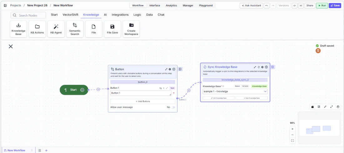
Use Cases
- Present account action options (“Check Balance”, “Transfer Funds”, “View Statements”) in a banking chatbot and route to the appropriate workflow branch
- Build an approval flow where reviewers click “Approve” or “Reject” to trigger different downstream actions
- Create a guided troubleshooting flow where users select their issue type from a set of buttons
- Offer product tier selection (“Basic”, “Professional”, “Enterprise”) in a sales chatbot to route to the right pricing workflow
- Implement a feedback collection step with sentiment buttons (“Satisfied”, “Neutral”, “Dissatisfied”) at the end of a support conversation
How It Works
Step 1: Add a Start Node
The Button node requires a Start node on the canvas. If no Start node is present, a dialog appears: “To use this node, drag a start node onto the canvas.” Add a Start node from the Start tab first.Step 2: Add the Button Node
In the workflow canvas, click the Chat tab in the node palette, click Listen, then select Button from the variant list. Drag it onto the canvas.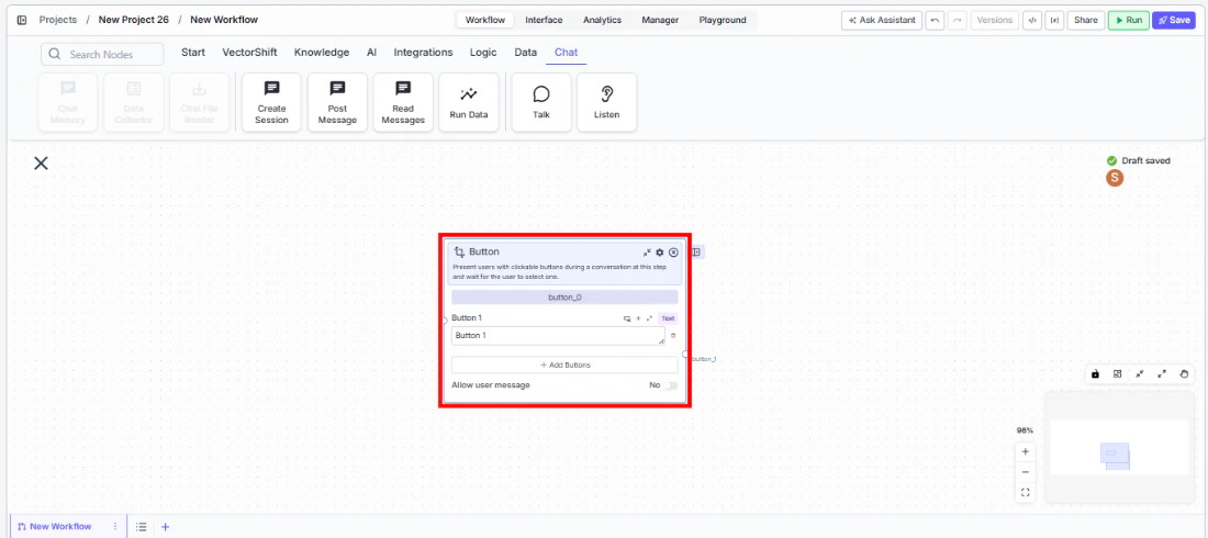
Step 3: Configure Buttons
The node starts with one button (Button 1). Edit the label text for each button. Click + Add Buttons to add more options. Remove unwanted buttons with the trash icon.Step 4: Configure Allow User Message (Optional)
ToggleAllow user message to Yes if you want the user to be able to type a free-text response instead of clicking a button. When enabled, a User Message output path appears on the node.Step 5: Connect Output Paths
Each button creates a separate output path handle (button_1, button_2, etc.). Connect each handle to the downstream nodes or branches that should execute when that button is clicked. If Allow user message is enabled, also connect the User Message output to a branch that handles free-text input.Step 6: Test the Flow
Deploy the workflow as a chatbot and verify that buttons appear at the correct step. Click each button and confirm it routes to the expected branch.Settings
| Setting | Type | Default | Description |
|---|---|---|---|
Button 1, Button 2, etc. | Text | Button 1 | The label displayed on each button. |
Allow user message | Toggle | No | Allow the user to type a message instead of clicking a button. |
Show Success/Failure Outputs | Toggle | Off | Show additional success/failure output handles. Advanced setting. |
Best Practices
- Use clear, action-oriented button labels. Labels like “Check Balance” or “Approve Transfer” are better than generic “Option A” or “Yes” — they tell the user exactly what will happen.
- Limit buttons to 3–5 options. Too many buttons overwhelm users. If you need more choices, consider cascading Button nodes (first select a category, then a sub-option).
- Enable Allow user message for flexibility. In many conversational flows, users may want to ask a question or provide context instead of picking a predefined option. Enable this toggle and route the free-text path to an LLM for handling.
- Use the complete output for shared logic. If some downstream processing should happen regardless of which button was clicked, connect the
completeadvanced output to that shared branch. - Pair with Talk nodes. Place a Talk (Message) node before the Button node to explain the choices — for example, “How can I help you today?” followed by the button options.
Related Templates
Customer Support Chatbot
Handles common customer inquiries and support tickets through conversational AI.
Banking Helpdesk
Assists banking customers with account inquiries, transactions, and product questions.
Webpage Customer Support Agent
Provides real-time customer support directly embedded within a website interface.
Refund/Expense Approval AI Agent
Reviews and routes refund or expense requests based on policy rules and approval thresholds.