Editing your Website Chatbot
The chatbot builder has four panels: Configuration, General, Style, and Advanced.Configuration
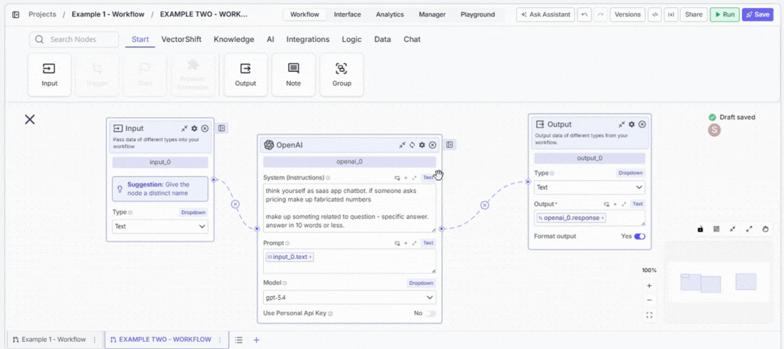
Connect the chatbot to the workflow or Agent that powers it.- Input — select the variable that carries the user’s message into your workflow. If you pick the wrong one, the bot receives an empty input and cannot respond correctly.
- Output — select the variable that carries the bot’s reply back to the user. This must point to the node where your final answer is generated.
- Use Latest Version — keep this on during active development so changes are reflected immediately. Pin a specific version before a production release to prevent unfinished changes from going live.
General
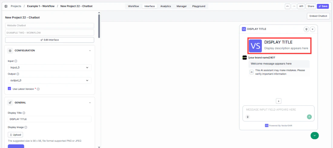
Display
The display section is the first thing visitors see when they open the chatbot. Getting it right means users immediately understand what the bot does and feel confident engaging with it.- Display Title — put your brand name here so users know they are talking to your product, not a generic tool. Replace
VectorShiftwith your company name or chatbot name, likeAcme SupportorReturns Helper. - Display Image — upload your logo so it appears in the chat header and next to bot messages throughout the conversation. A recognizable image builds trust before the user has sent a single message. Recommended size: 56 × 56 px, PNG or JPEG.
- Show Header Icon — turn this off if you want a clean, text-only header without an image. Useful when your logo does not scale well to small sizes.
- Show welcome display — turn this off to skip the welcome screen entirely and drop users straight into the chat. Best for returning users who already know what the bot does.
- Welcome display description — tell visitors what the chatbot can help with before they ask. Replace the default
Hi, how can I assist you today?with something specific likeAsk me about your portfolio, account settings, or compliance questions. A clear description reduces hesitation and gets users to the right question faster. - Welcome message — have the bot break the ice automatically when a user opens a new conversation. A message like
Hi! I can help with portfolio questions, account settings, and compliance inquiries. What can I help you with today?sets expectations and eliminates the blank-page effect.
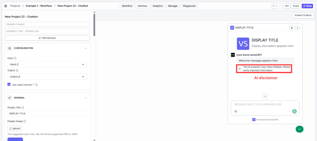
AI disclaimer
For regulated industries like finance, healthcare, or legal, displaying an AI notice on bot responses is often a compliance requirement — not just a nice-to-have.- Show AI disclaimer under bot message — turn this on to add a visible notice to bot responses so users know they are interacting with AI, not a human. Disabled by default.
- AI disclaimer text — customize the wording to match your legal requirements or brand tone. The default is:
This AI assistant is provided for informational purposes only. Responses may not always be accurate or complete. - AI disclaimer placement —
On Last Message(default) shows the disclaimer only on the most recent bot response, keeping older messages clean. Change this if your compliance policy requires it on every message.
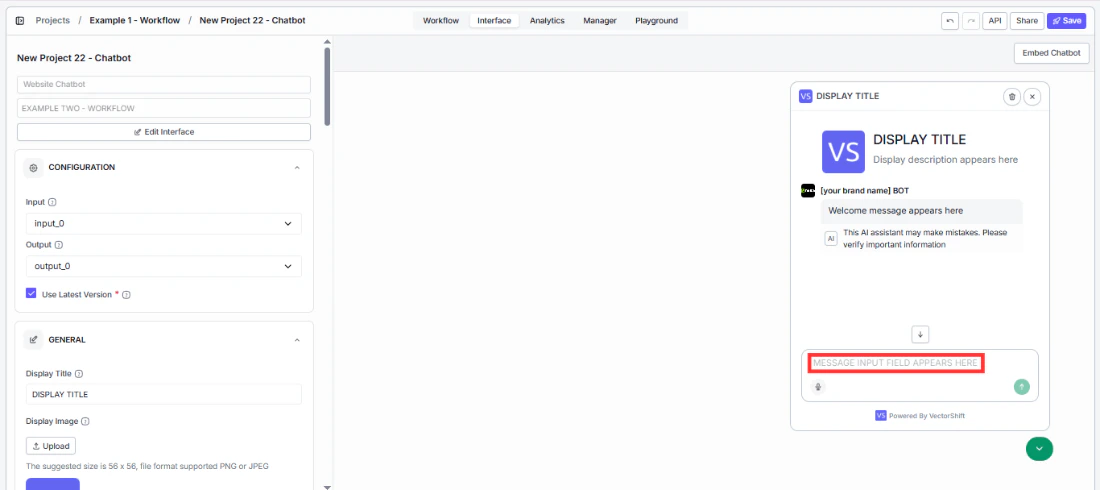
Message input
- Placeholder for message input field — guide visitors toward the right first question instead of leaving them staring at a blank box. Change
Type your message here...to something that matches your use case, likeAsk about your portfolio or account status.... The more specific the placeholder, the faster users engage.
Suggested prompts
Give visitors a running start. Instead of a blank input box, they see clickable buttons for the most common questions and can get an answer in one click without typing anything. Toggle Enable initial prompts, then click + Add Suggestion to add prompts. Each suggestion has a Title (the button users see) and Content (the message sent when clicked).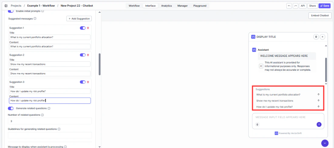
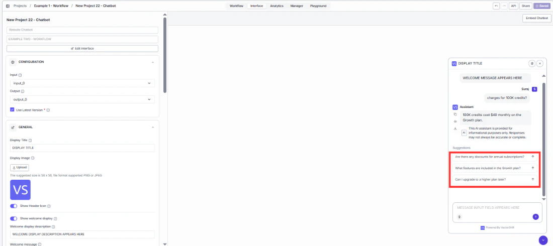
Follow-up questions
After the bot responds, it can suggest what to ask next — keeping users in the conversation and helping them discover features or answers they would not have thought to look for.- Generate related questions — turn this on to automatically surface follow-up questions after each response. Enabled by default.
- Number of related questions —
3is a good starting point. Enough to spark the next question without cluttering the screen. Increase this if your chatbot covers a wide topic area. - Guidelines for generating related questions — prevent the bot from suggesting questions it cannot handle. For example:
Focus on portfolio performance, risk management, and account settings. Do not suggest questions about specific stock picks or legal advice.Without guidelines, follow-ups may send users down paths the bot handles poorly.
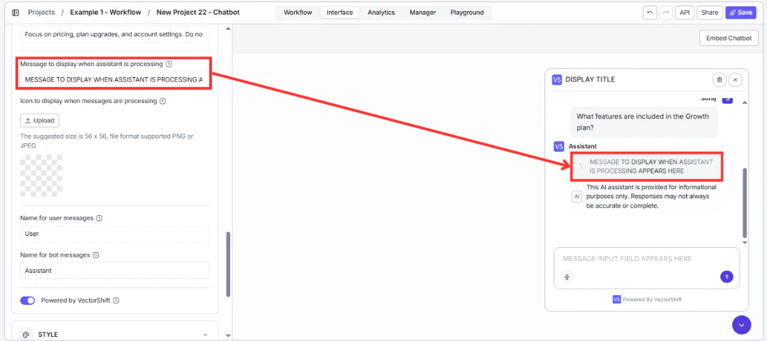
Processing indicator
While the bot generates a response, users see a loading state. A well-configured indicator reassures users that something is happening and reduces the feeling of waiting.- Message to display when assistant is processing — replace the generic
Understanding your request...with something that reflects what your bot is actually doing.Analyzing your portfolio...orSearching our knowledge base...feels more purposeful and specific to your use case. - Icon to display when messages are processing — upload a custom loading icon (56 × 56 px, PNG or JPEG). An animated GIF with your logo creates a polished, branded experience during the wait.
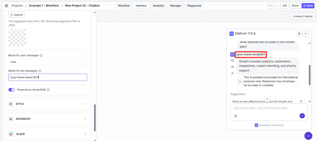
Message senders
These labels appear next to every message in the conversation. Small changes here make the chatbot feel purpose-built for your product.- Name for user messages — change
Userto something that fits your audience.Youfeels conversational;Customerfits a support tool;Visitorworks for a general website widget. - Name for bot messages — change
Assistantto your bot’s name or your brand. Every response carries this label, so it reinforces your identity throughout the conversation. Use your product name or something likeAcme Advisor.
Branding
- Powered by VectorShift — turn this off if you are building a white-labeled product and do not want end users to see the underlying platform. Once disabled, only your branding is visible.
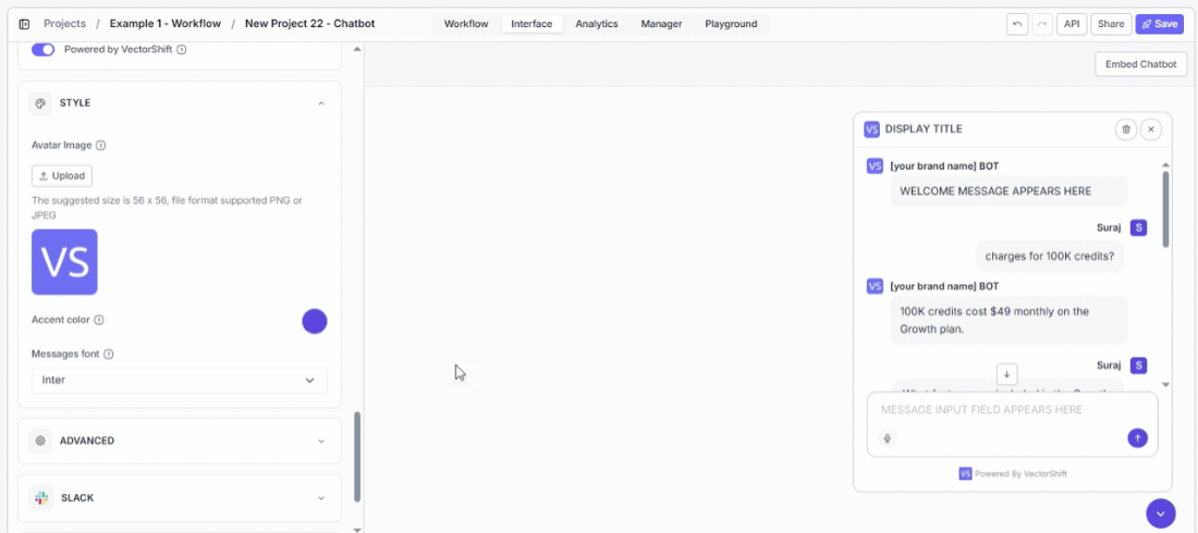
Style
A chatbot that matches your website feels like part of the experience. One that does not looks like an external widget bolted on.- Avatar Image — upload your logo so your brand appears in every bot response bubble, not just the header. This is the most visible branding element during an active conversation. Recommended size: 56 × 56 px, PNG or JPEG.
- Accent color — set this to your primary brand color so buttons and interactive elements feel native to your site instead of defaulting to VectorShift purple.
- Messages font — match this to your website’s typography. A font mismatch is a subtle signal to users that the chat is a third-party add-on rather than a built-in product feature.
Advanced settings
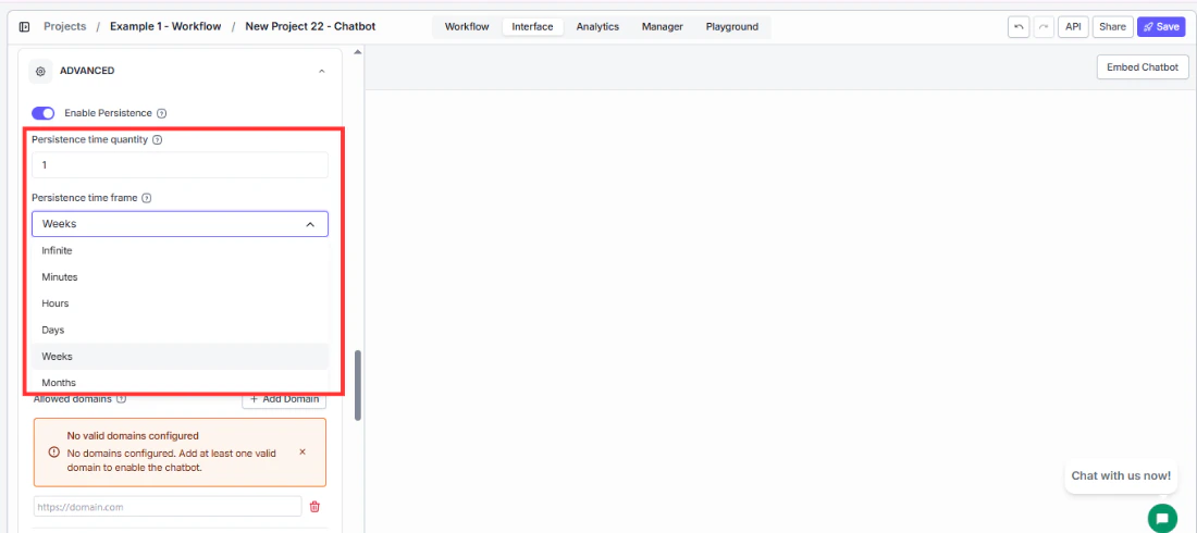
The Advanced panel controls how the embedded widget behaves on the page.Conversation persistence
Control whether returning visitors pick up where they left off or start fresh each time they visit.- Enable Persistence — turn this on so returning users see their previous conversation instead of starting from scratch every visit. Enabled by default.
- Persistence time quantity and Persistence time frame — set how long the conversation stays alive before expiring. Defaults to
1 Week. Set a number and choose a unit: Minutes, Hours, Days, Weeks, or Months.
Message limit and visibility
- Embedded chatbot should start open — turn this on for dedicated support pages where the chatbot is the main reason users are there. Leave it off on content-heavy pages where an auto-opening widget would distract from the main experience.
- Message limit per conversation — set a cap to control costs on high-traffic bots. When a user reaches the limit, they need to start a new conversation. Leave blank for no limit.
- Show remaining number of messages — turn this on when you have a message limit set, so users are not caught off guard when they hit it. A visible counter sets expectations before the conversation gets cut off.
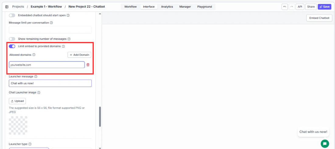
Domain limiting
- Limit embed to provided domains — turn this on before going live so your chatbot only loads on your own websites. If someone copies your embed code and pastes it on their own site, this blocks the widget from loading there. Only the domains you specify will work.
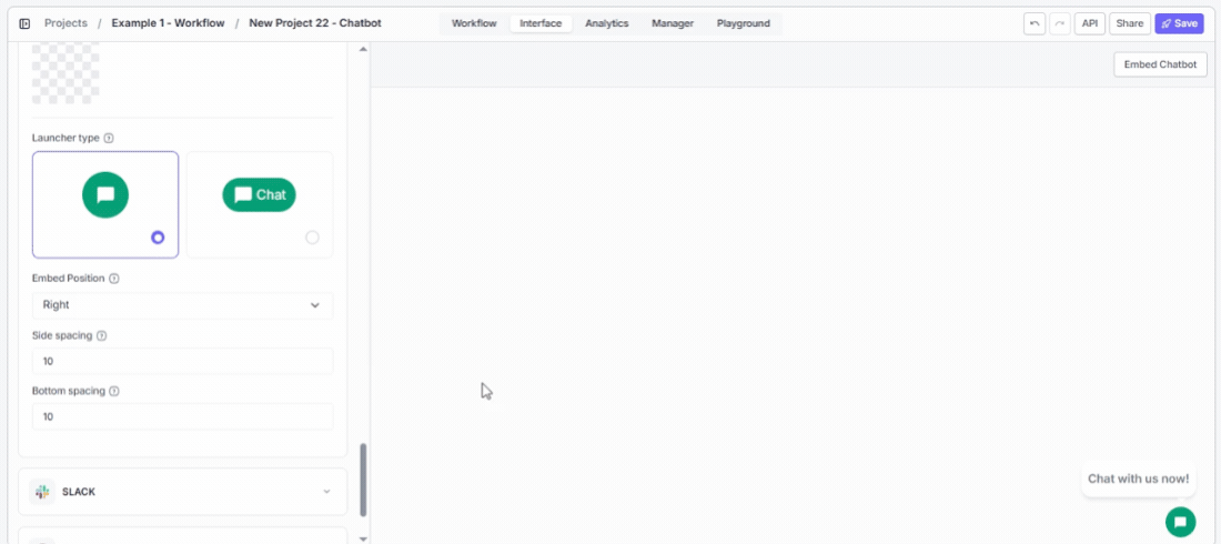
Launcher
The launcher is the button that draws users in before they start chatting. A well-configured launcher gets more clicks without being intrusive.- Launcher message — write something that speaks directly to what your visitors are there to do.
Have a question about your portfolio?outperforms the genericChat with us now!because it matches user intent the moment they see it. - Chat Launcher image — replace the default chat bubble with your logo or a custom icon so the launcher looks like it belongs on your site rather than a generic widget. Recommended size: 56 × 56 px, PNG or JPEG.
- Launcher type — choose Icon + Chat label if you want higher click-through rates. The text label tells users what the button does and removes the hesitation that comes with an unlabeled icon.
- Embed Position — place the launcher where it does not overlap other fixed elements on your page such as cookie banners or help widgets. Defaults to
Right. - Side spacing — increase this if the launcher sits on top of another element on the right or left edge of your page. Defaults to
10px. - Bottom spacing — increase this if the launcher overlaps a footer bar or floating element at the bottom of your page. Defaults to
10px.
Embedding in your site
VectorShift provides two embed methods:| Script tag (preferred) | iFrame | |
|---|---|---|
| What users see | A floating launcher button in the corner of the page. Clicking it opens a chat window that overlays the page content. Users can collapse and reopen it at any time. | The chatbot is rendered inline as a fixed box on the page. It’s always visible and cannot be collapsed. |
| Best for | Most websites — works on WordPress, Squarespace, Webflow, Framer, and custom HTML. | Platforms that block external scripts (e.g., Wix free plan), or when you want the chatbot inside a specific section of a page. |
| Customization | Set chatbot-height (default 600px) and chatbot-width (default 400px) as attributes on the tag. | Control width, height, style, and allow attributes directly on the <iframe> tag. |
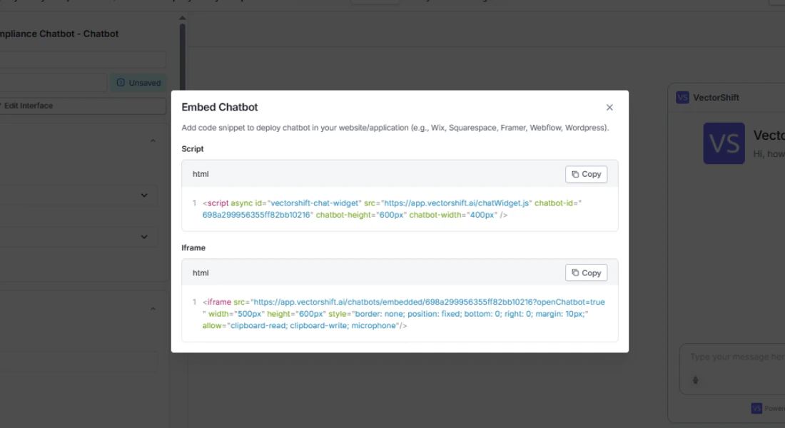
Via script tag (preferred)
Via iFrame
Platform-specific guides
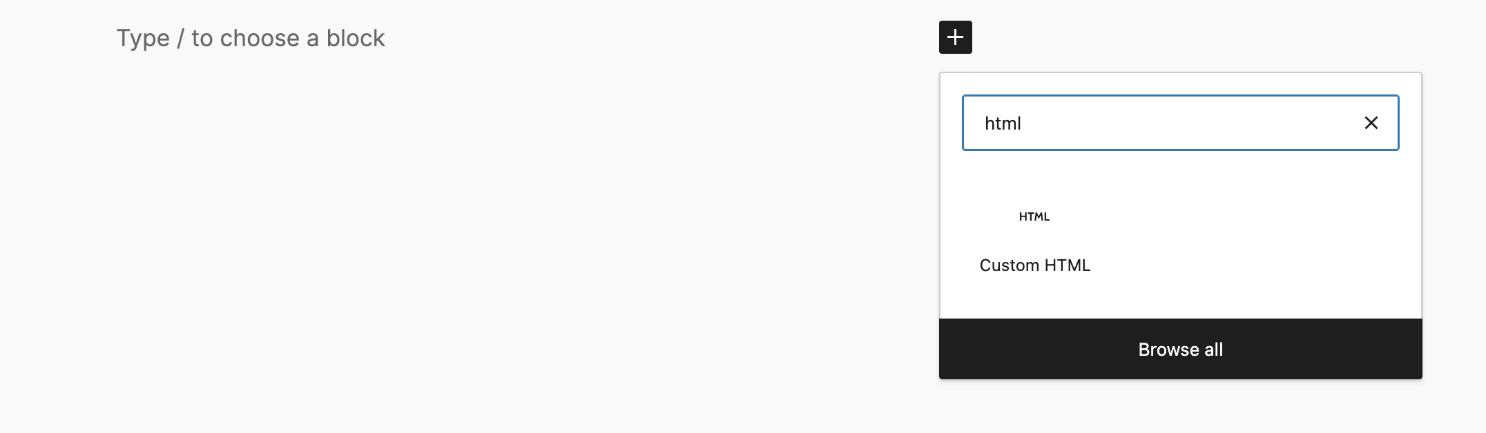
WordPress
- Open your WordPress dashboard and create a new post (or open an existing one).
- Click the + button in the block editor, search for Custom HTML, and add the block.
- Paste the script tag snippet from VectorShift into the block.
- Publish the post and verify the launcher appears on the page.
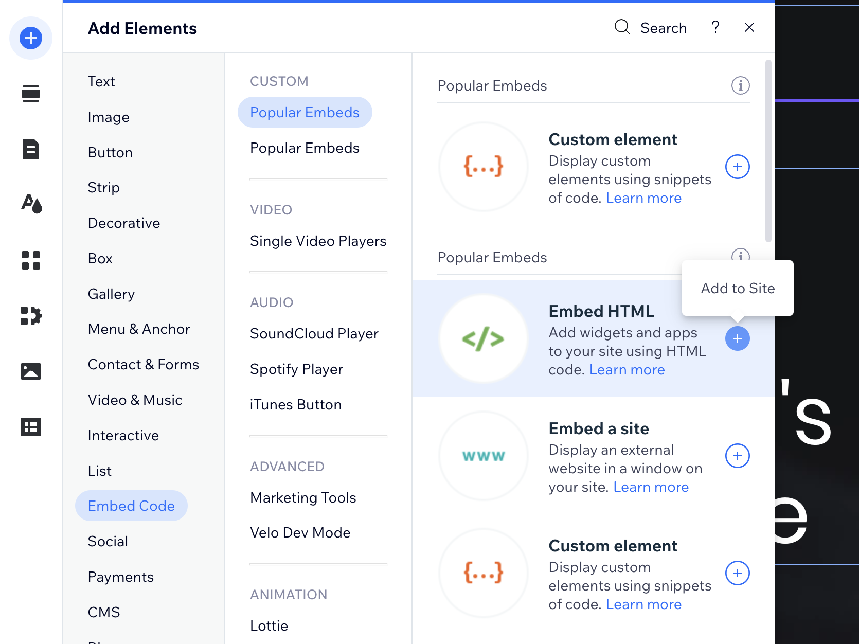
Wix
- Open the Wix Editor and click Add in the left panel.
- Search for and add an Embed HTML element to your page.
- Paste the iFrame snippet (Wix’s free plan does not support external script tags).
- Drag the element’s handles to make the chatbot fully visible.
- Publish and test on your live site.
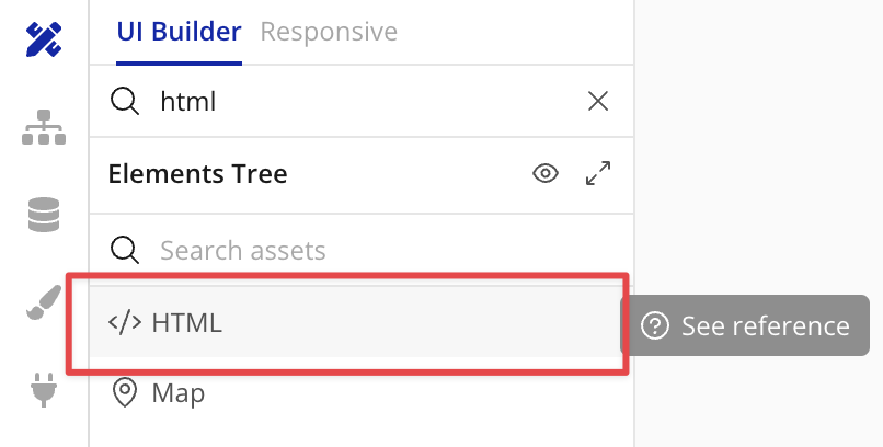
Bubble.io
- Open the Bubble.io UI Builder and drag an HTML element onto your page.
- Paste the script tag snippet from VectorShift.
- Check the Display as an iFrame option in the element settings.
- In the Layout tab, set the minimum height to
610px. - Preview or deploy to see the chatbot running.
Chrome Extension
Toggle Deploy to Chrome Extension in the Chrome panel to make this chatbot accessible through the VectorShift Chrome Extension. Once deployed, users with the extension installed can open the chatbot directly from their browser without visiting your website.Troubleshooting
- The widget does not appear. Check your browser’s developer console for script errors. Verify the chatbot ID in the embed code is correct.
- The chatbot loads but voice input does not work in the iFrame. Verify that the
allow="clipboard-read; clipboard-write; microphone"attribute is present on the<iframe>tag. - The script tag does not load on Wix. Wix’s free plan blocks external scripts. Switch to the iFrame method instead.
- The launcher overlaps with other elements. Increase Bottom spacing and Side spacing, or switch Embed Position from Right to Left.
Next steps
Deploy to Slack
Let your team chat with the bot directly in Slack
Deploy via WhatsApp and SMS
Connect to WhatsApp or SMS through Twilio
Analytics
Track usage, review conversations, and export data