Basics
This is where you define what your portal is and what it offers.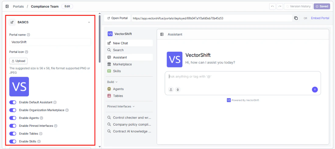
Portal name
The name your users see. Choose something descriptive — “Customer Support Hub” is more helpful than “Portal 1.”Portal icon
Upload a custom icon (PNG or JPEG, 56x56px recommended) to give your portal a recognizable identity. This appears in the top left corner of the portal.Feature toggles
These toggles control what your users can access inside the portal. Turn on only what is relevant to your audience — a cleaner portal means less confusion and faster onboarding.- Enable Default Assistant: Give users an agentic chat interface where they can ask questions, tag specific interfaces with
@, and upload files. - Enable Organization Marketplace: Let users discover and deploy templates from your organization’s shared library.
- Enable Agents: Let users view, interact with, and build their own agents inside the portal.
- Enable Pinned Interfaces: Surface specific interfaces directly in the sidebar for one-click access.
- Enable Tables: Let users view and work with data tables, or create their own.
- Enable Skills: Let users view and create reusable content blocks that agents and interfaces can reference.
Add Template
If you have enabled Tables, you can provide your users with a head start by adding table templates. Click + Add Template to select one of your existing tables as a starting point. Users can then create new tables from that template or build from scratch.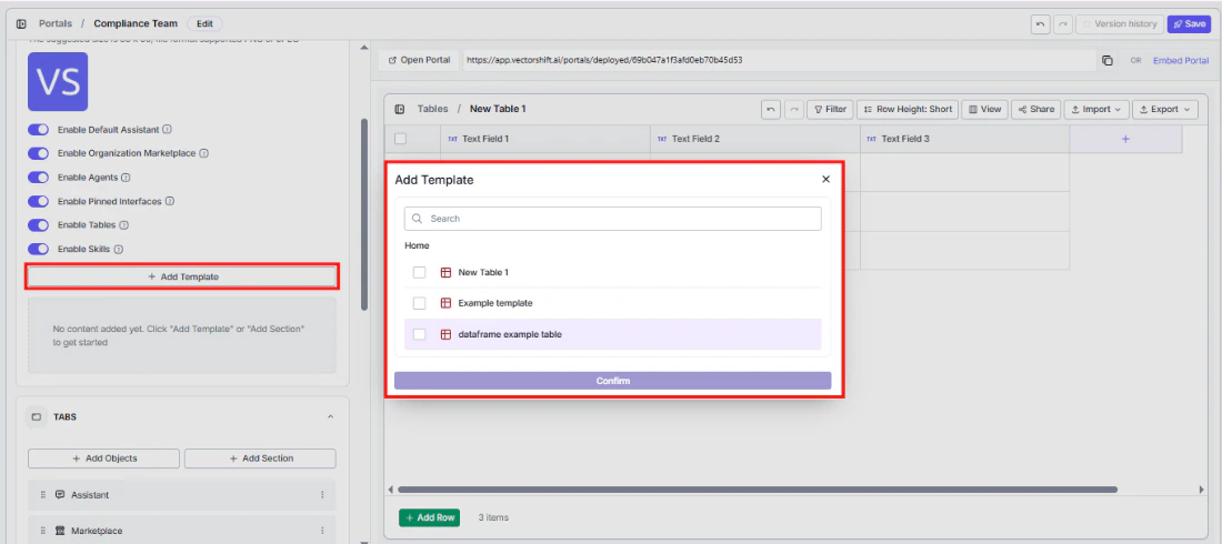
Tabs
This is where you shape what your users see in the sidebar — and in what order.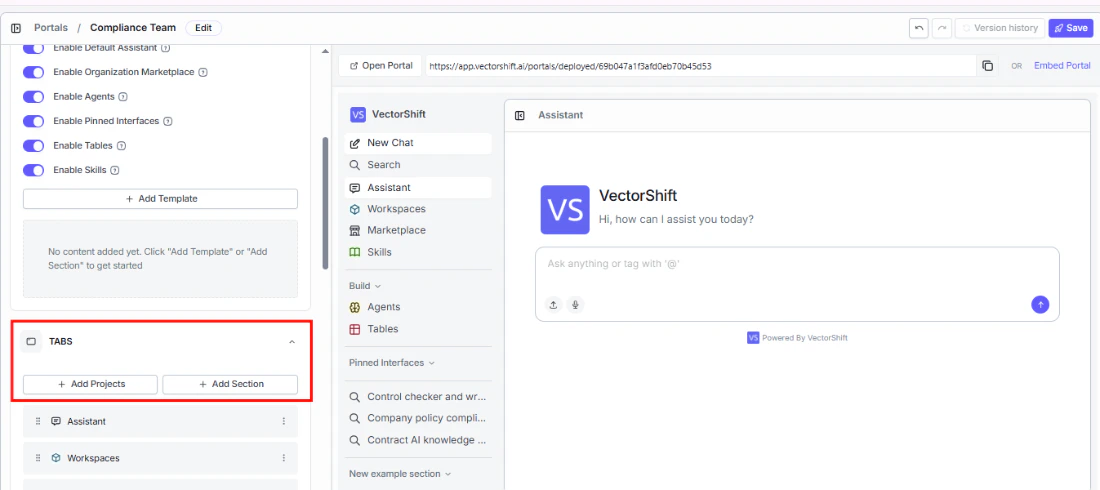
Add Projects
Click + Add Projects to make your existing projects and workflows directly accessible to portal users. Browse or search the list, select what you want to include, and click Confirm.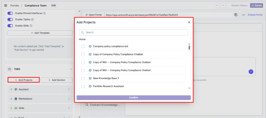
Portals cannot be added as tabs inside other portals — this prevents circular references.
Add Section
Keep your sidebar organized by grouping related tabs under collapsible headings. For example, create a “Research Tools” section and add all your research interfaces under it, so users do not have to hunt through a flat list.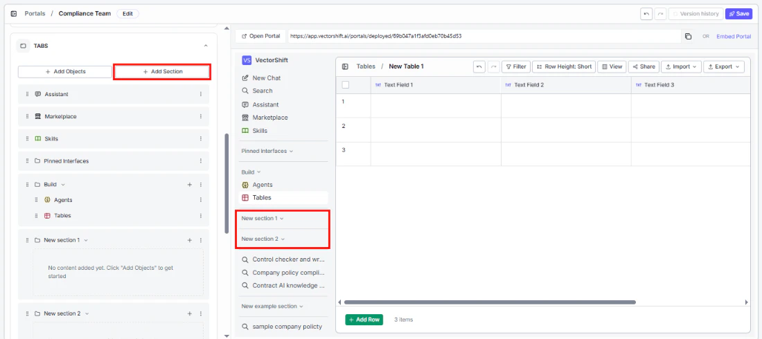
Tab list
The tab list shows everything currently in your portal’s sidebar, in the order users will see it. The defaults are:- Assistant: The agentic chat interface.
- Marketplace: Your organization’s template library.
- Build (section): Contains Agents and Tables.
- Pinned Interfaces (section): Quick-access interfaces you have pinned.
- Skills: The skills library.
- Any projects you added during creation appear below these.
Rearranging and removing tabs
You have full control over the sidebar layout. Drag any tab using the handle on the left to reorder it — the order here is exactly what your users see. Use the three-dot menu on the right to:- Edit: Rename or reconfigure a tab.
- Delete: Remove it from the portal entirely.
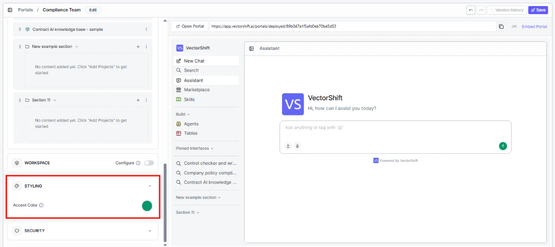
Styling
Make the portal feel like your product, not a generic tool.Accent color
Security
Control who can access your portal and how they authenticate.Protect with SSO Auth
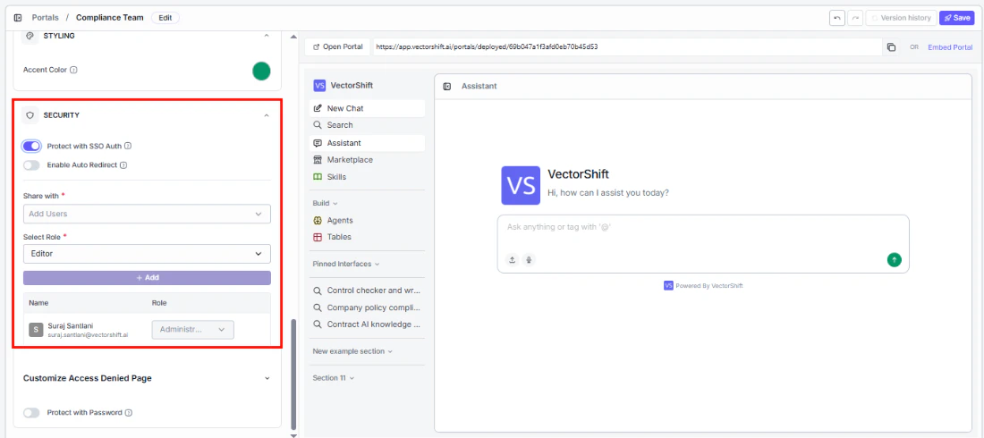
- Enable Auto Redirect: When turned on, unauthenticated users are sent straight to the SSO login page instead of seeing an access denied screen — a smoother experience for your users.
Share with (required)
Add specific users by name or email who should have access to this portal.Select Role (required)
Assign a role to control what each user can do:- Runner: Can use the portal but cannot view or edit its configuration or any sub-objects.
- Editor: Can use, view, and edit the portal and its sub-objects.
- Administrator: Full control — can use, view, edit, delete, and share the portal and its sub-objects.
Customize Access Denied page
When someone without permission tries to access your portal, they see an access denied screen. You can customize it to match your tone:- Permission Text: The main message. Defaults to “You do not have permission to access this portal.”
- Contact Text: Guidance on what to do next. Defaults to “Please contact the owner to request access.”
- Icon Color: The color of the icon on the screen.
Protect with Password
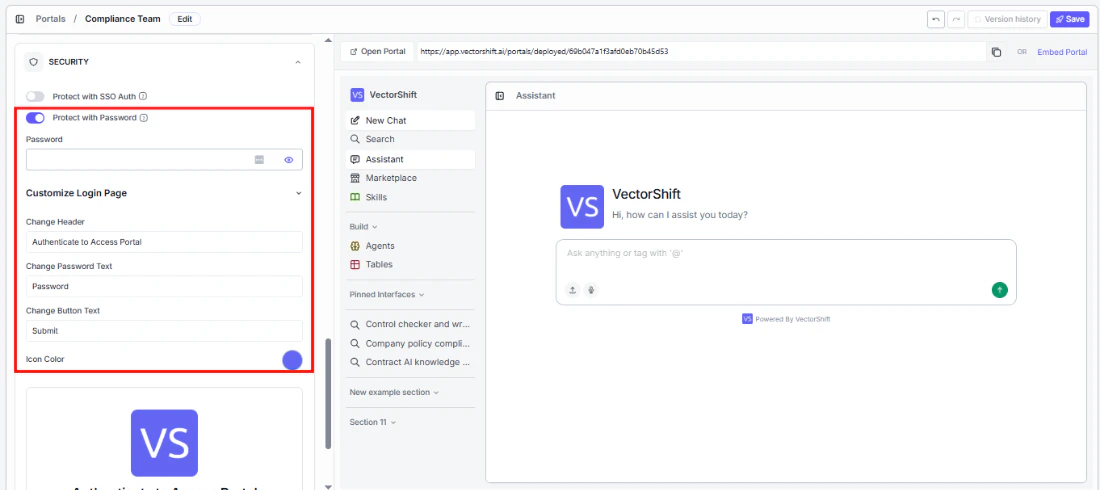
Customize Login page
Make the password login screen feel on-brand. A live preview updates as you edit:- Change Header: The heading text. Defaults to “Authenticate to Access Portal.”
- Change Password Text: The label for the password field. Defaults to “Password.”
- Change Button Text: The button label. Defaults to “Submit.”
- Icon Color: The icon color on the login screen.