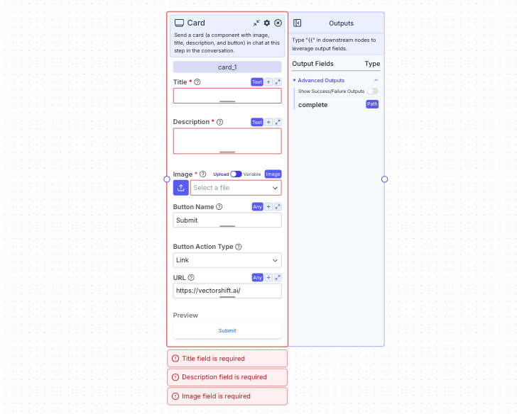
- If toggle is on “Variable”, reference images from other nodes
- If toggle is on “Upload”, upload an image directly on the node
Node Inputs
- Title: The card’s title
- Type:
Text
- Type:
- Description: The card’s description
- Type:
Text
- Type:
- Image: The image in the card
- Type:
Image
- Type:
- Button Name: The name of the button
- Type:
Text
- Type:
- Button URL: The URL to navigate to when the button is clicked
- Type:
Text
- Type:
Node Parameters
On the face of the node:- Button Action Type: Select the action to occur when the button is clicked. Currently only
Linkis available.
Node Outputs
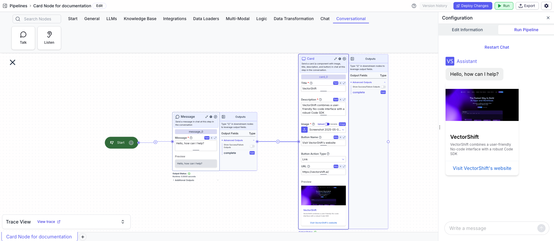
The card node does not have any node outputs but can be connected to other nodes by connecting the edge with other nodes.Example
The below example is a pipeline that sends a message and a card at the beginning of a conversation.- Start Node: Represents the entry point of the pipeline
- Message Node: Displays the message to the user
- Message:
Hello, how can I help?
- Message:
- Card Node: Displays the card to the user
- Title:
VectorShift - Description:
VectorShift combines a user-friendly No-code interface with a robust Code SDK - Image:
[Uploaded Image] - Button Name:
Visit VectorShift website - Button URL:
https://vectorshift.ai/
- Title: