> ## Documentation Index
> Fetch the complete documentation index at: https://docs.vectorshift.ai/llms.txt
> Use this file to discover all available pages before exploring further.
# Customizing your chatbot
> Match your brand colors, set welcome messages, and configure every visual detail
You have created a chatbot and it works, but right now it says "VectorShift" at the top, uses a default purple accent, and greets users with a generic welcome message. Before you put it in front of customers, you want it to look and feel like your own product.
The chatbot builder gives you full control over the chatbot's appearance and behavior through eight settings panels. You can change the connected Agent or workflow, rename the bot, apply your brand colors, configure starter prompts, set up a custom launcher icon for embedded widgets, and much more.
## What can customization do?
You can match your brand identity with custom colors across the entire interface, set your own bot name and description so users see your product name instead of "VectorShift," and configure welcome messages with starter prompts that guide users toward the right questions. The builder also lets you enable follow-up question generation, customize the launcher for embedded chatbots, control how long conversations persist for returning visitors, enable file uploads (requires a [Chat File Reader node](/platform/pipelines/chat/chat-file-reader) in your workflow), and cap messages per conversation.
The examples below continue with the "Order Support" chatbot from [Creating a chatbot](/platform/interfaces/chatbots/creating), now being branded for an online store.
## Step 1. Configure the Agent or workflow
The Workflow panel lets you change which Agent or workflow powers the chatbot or open the editor directly from the builder.
 * **Workflow Selection** lets you switch to a different Agent or workflow at any time.
* **Input** determines which variable receives the user's message.
* **Output** determines which variable returns the chatbot's reply.
* **Edit / New** opens the Agent or workflow editor so you can modify the connected workflow without leaving the chatbot builder, or create a new one from scratch.
## Step 2. Set the basics
The General panel controls the chatbot's core behavior settings: its disclaimer text, message limits, and several feature toggles.
* **Workflow Selection** lets you switch to a different Agent or workflow at any time.
* **Input** determines which variable receives the user's message.
* **Output** determines which variable returns the chatbot's reply.
* **Edit / New** opens the Agent or workflow editor so you can modify the connected workflow without leaving the chatbot builder, or create a new one from scratch.
## Step 2. Set the basics
The General panel controls the chatbot's core behavior settings: its disclaimer text, message limits, and several feature toggles.
 ### Disclaimer
Add a disclaimer message that appears to users before they begin chatting. This is useful for informing users about data usage, accuracy limitations, or legal considerations. Leave it blank to show no disclaimer. The AI disclaimer text defaults to: "This AI assistant is provided for informational purposes only. Responses may not always be accurate or complete."
### Message limit per conversation
Set the maximum number of messages a user can send in a single conversation. By default, this is unlimited (no cap). When a limit is set and a user reaches it, they will need to start a new conversation to continue chatting.
### Feature toggles
* **Allow Stop Generation** lets users click a stop button to cancel the bot's response while it is being generated.
* **Keep Chat Open** controls whether the embedded chat window starts in an open state when the page loads, rather than waiting for the user to click the launcher.
* **Allow Clear Chat** adds a button that lets users clear their current conversation history.
* **Show Remaining Message Info** displays a counter showing how many messages the user has left when a message limit is set.
* **Turn On User Feedback** adds thumbs-up and thumbs-down buttons to each bot response so users can rate the quality of answers.
## Step 3. Customize message senders
The Message Senders panel controls the display names and placeholder text in the chat interface.
### Disclaimer
Add a disclaimer message that appears to users before they begin chatting. This is useful for informing users about data usage, accuracy limitations, or legal considerations. Leave it blank to show no disclaimer. The AI disclaimer text defaults to: "This AI assistant is provided for informational purposes only. Responses may not always be accurate or complete."
### Message limit per conversation
Set the maximum number of messages a user can send in a single conversation. By default, this is unlimited (no cap). When a limit is set and a user reaches it, they will need to start a new conversation to continue chatting.
### Feature toggles
* **Allow Stop Generation** lets users click a stop button to cancel the bot's response while it is being generated.
* **Keep Chat Open** controls whether the embedded chat window starts in an open state when the page loads, rather than waiting for the user to click the launcher.
* **Allow Clear Chat** adds a button that lets users clear their current conversation history.
* **Show Remaining Message Info** displays a counter showing how many messages the user has left when a message limit is set.
* **Turn On User Feedback** adds thumbs-up and thumbs-down buttons to each bot response so users can rate the quality of answers.
## Step 3. Customize message senders
The Message Senders panel controls the display names and placeholder text in the chat interface.
 * **User Name** sets the label shown next to user messages. Defaults to `User`. For the Order Support chatbot, you might change this to `Customer`.
* **Bot Name** sets the label shown next to bot responses. Defaults to `Assistant`. Change it to your product name or bot persona, like `Order Support`.
* **Input Field Placeholder** is the hint text shown in the message input box before the user starts typing. Defaults to `Write a message`.
* **Response Loader Label** is the text shown while the chatbot is processing a response. Defaults to `Understanding your request...`. You could change this to something like `Looking up your order...` to match the chatbot's purpose.
## Step 4. Configure message prompts
The Message Prompts panel configures the welcome message, error message, suggested starter prompts, and follow-up question generation.
* **User Name** sets the label shown next to user messages. Defaults to `User`. For the Order Support chatbot, you might change this to `Customer`.
* **Bot Name** sets the label shown next to bot responses. Defaults to `Assistant`. Change it to your product name or bot persona, like `Order Support`.
* **Input Field Placeholder** is the hint text shown in the message input box before the user starts typing. Defaults to `Write a message`.
* **Response Loader Label** is the text shown while the chatbot is processing a response. Defaults to `Understanding your request...`. You could change this to something like `Looking up your order...` to match the chatbot's purpose.
## Step 4. Configure message prompts
The Message Prompts panel configures the welcome message, error message, suggested starter prompts, and follow-up question generation.
 ### Welcome and error messages
* **Welcome Message** is the first message the bot sends when a user opens a new conversation. Use this to set expectations: what the chatbot can help with, what it cannot do, and how to get started.
* **Error Message** is displayed when the chatbot encounters a problem running the workflow. A clear error message helps users understand that the issue is temporary and they should try again.
### Suggested starter prompts
Toggle **Suggest Initial Prompts** to show up to four clickable prompts at the start of each conversation. These give users a quick way to begin without having to think of a first question.
When enabled, you can fill in up to four prompts:
* **Prompt A** through **Prompt D** each accept a short question or statement that users can click to send immediately. For the Order Support chatbot, these might be: "Where is my order?", "How do I return an item?", "What are your shipping options?", and "I need to update my address."
### Follow-up question generation
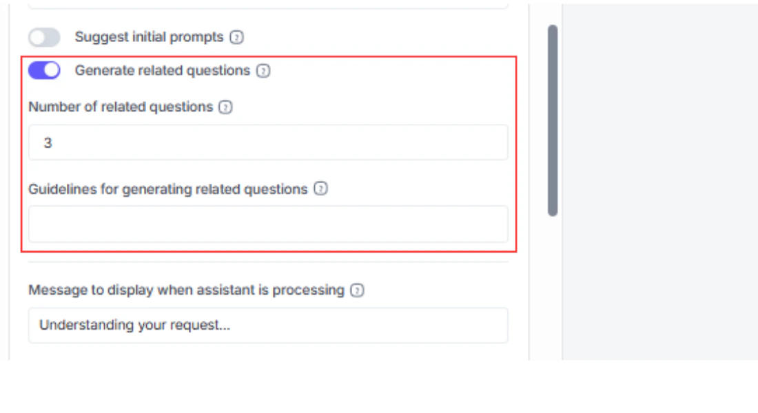
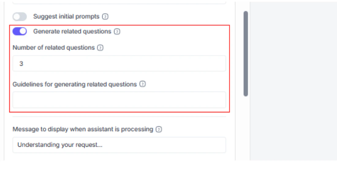
Toggle **Generate Related Questions** (enabled by default) to have the chatbot suggest follow-up questions after each response. This keeps the conversation flowing and helps users discover what else the chatbot can answer.
* **Number of Related Questions** controls how many follow-up suggestions appear after each reply. Set this to any value from 1 to 10. Defaults to `3`.
* **Guidelines for Generating Follow-up Questions** is an optional text field where you can provide instructions that shape the follow-up suggestions. For example: "Focus questions on order tracking, returns, and shipping. Avoid questions about products or pricing." This prompt is sent to the model that generates the follow-ups (internally, VectorShift uses a separate LLM call to produce these suggestions).
## Step 5. Design the welcome header
The Welcome Header panel controls the visual header that appears at the top of the chat interface before the user sends their first message.
### Welcome and error messages
* **Welcome Message** is the first message the bot sends when a user opens a new conversation. Use this to set expectations: what the chatbot can help with, what it cannot do, and how to get started.
* **Error Message** is displayed when the chatbot encounters a problem running the workflow. A clear error message helps users understand that the issue is temporary and they should try again.
### Suggested starter prompts
Toggle **Suggest Initial Prompts** to show up to four clickable prompts at the start of each conversation. These give users a quick way to begin without having to think of a first question.
When enabled, you can fill in up to four prompts:
* **Prompt A** through **Prompt D** each accept a short question or statement that users can click to send immediately. For the Order Support chatbot, these might be: "Where is my order?", "How do I return an item?", "What are your shipping options?", and "I need to update my address."
### Follow-up question generation
Toggle **Generate Related Questions** (enabled by default) to have the chatbot suggest follow-up questions after each response. This keeps the conversation flowing and helps users discover what else the chatbot can answer.
* **Number of Related Questions** controls how many follow-up suggestions appear after each reply. Set this to any value from 1 to 10. Defaults to `3`.
* **Guidelines for Generating Follow-up Questions** is an optional text field where you can provide instructions that shape the follow-up suggestions. For example: "Focus questions on order tracking, returns, and shipping. Avoid questions about products or pricing." This prompt is sent to the model that generates the follow-ups (internally, VectorShift uses a separate LLM call to produce these suggestions).
## Step 5. Design the welcome header
The Welcome Header panel controls the visual header that appears at the top of the chat interface before the user sends their first message.
 ### Image and branding
* **Show Welcome Image** toggles the display of a header image. Enabled by default.
* **Display Image Size** adjusts the size of the welcome image using a slider.
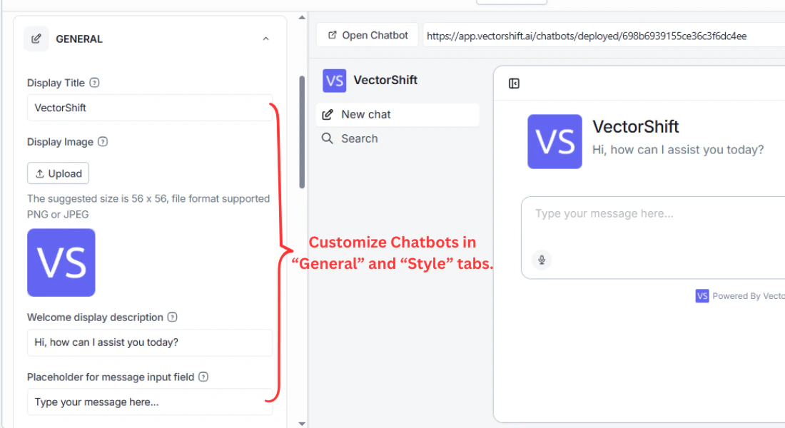
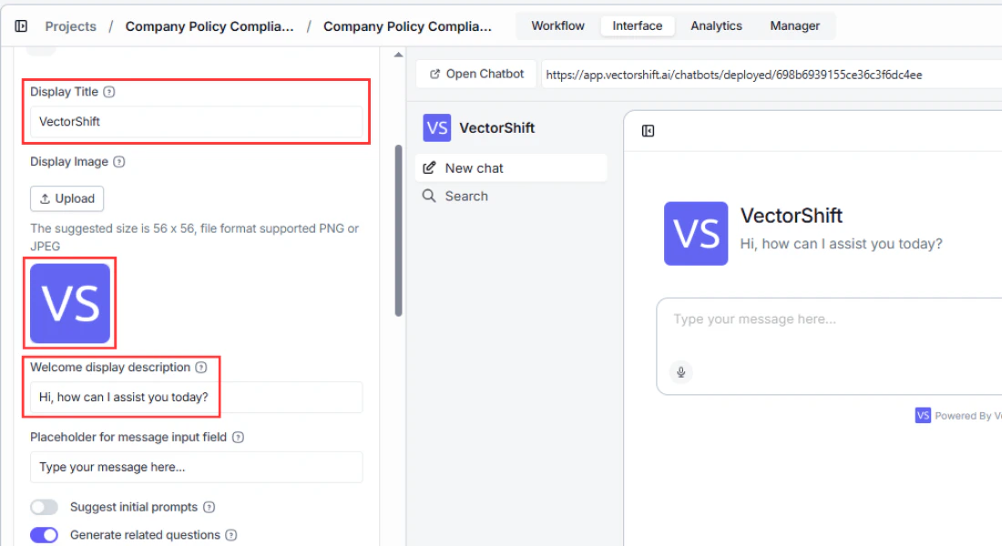
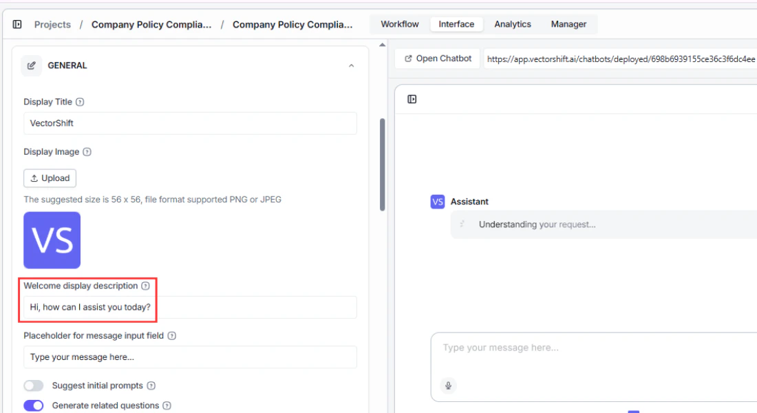
* **Display Name** is the large heading text at the top of the chat. Defaults to `VectorShift`. Change this to your chatbot's name or your company name.
* **Display Description** is the subtitle text below the display name. Defaults to `Hi, how can I assist you today?`. Replace this with something specific to your chatbot's purpose, like `Ask me about orders, returns, and shipping`.
### Typography controls
You have fine-grained control over the text appearance of both the display name and the description:
* **Font Style** sets the text to normal, italic, or bold for both the display name and description independently.
* **Font Size** adjusts the text size for each element.
* **Font Weight** controls the thickness of the text.
* **Font Color** sets the text color. Use this to match your brand palette.
* **Display Description Alignment** positions the description text to the left, center, or right.
## Step 6. Apply your brand styling
The Styling panel is where you apply your brand colors across the entire chatbot interface.
### Image and branding
* **Show Welcome Image** toggles the display of a header image. Enabled by default.
* **Display Image Size** adjusts the size of the welcome image using a slider.
* **Display Name** is the large heading text at the top of the chat. Defaults to `VectorShift`. Change this to your chatbot's name or your company name.
* **Display Description** is the subtitle text below the display name. Defaults to `Hi, how can I assist you today?`. Replace this with something specific to your chatbot's purpose, like `Ask me about orders, returns, and shipping`.
### Typography controls
You have fine-grained control over the text appearance of both the display name and the description:
* **Font Style** sets the text to normal, italic, or bold for both the display name and description independently.
* **Font Size** adjusts the text size for each element.
* **Font Weight** controls the thickness of the text.
* **Font Color** sets the text color. Use this to match your brand palette.
* **Display Description Alignment** positions the description text to the left, center, or right.
## Step 6. Apply your brand styling
The Styling panel is where you apply your brand colors across the entire chatbot interface.
 * **Font Selection** lets you pick a font family for the chatbot. Defaults to `Inter`.
* **Font Size** adjusts the base font size for all chat text.
* **Top Bar** color sets the background of the bar at the top of the chat window.
* **Background** color controls the main chat area background.
* **Accent** color is used for buttons, links, and other interactive elements. Defaults to `#513dd9`, a deep indigo that matches VectorShift's own branding. You can enter any valid hex value.
* **User Name** and **Bot Name** colors let you differentiate the sender labels visually.
* **Input Bubble** and **Output Bubble** colors control the background of user and bot message bubbles respectively.
* **Input Text** and **Output Text** colors control the text inside those message bubbles.
For a cohesive look, set the accent color to your primary brand color, then adjust the bubble and text colors to complement it. Test with both light and dark backgrounds to make sure text stays readable.
## Step 7. Configure the bottom bar
The Bottom Bar panel configures the footer area at the bottom of the chatbot window.
* **Font Selection** lets you pick a font family for the chatbot. Defaults to `Inter`.
* **Font Size** adjusts the base font size for all chat text.
* **Top Bar** color sets the background of the bar at the top of the chat window.
* **Background** color controls the main chat area background.
* **Accent** color is used for buttons, links, and other interactive elements. Defaults to `#513dd9`, a deep indigo that matches VectorShift's own branding. You can enter any valid hex value.
* **User Name** and **Bot Name** colors let you differentiate the sender labels visually.
* **Input Bubble** and **Output Bubble** colors control the background of user and bot message bubbles respectively.
* **Input Text** and **Output Text** colors control the text inside those message bubbles.
For a cohesive look, set the accent color to your primary brand color, then adjust the bubble and text colors to complement it. Test with both light and dark backgrounds to make sure text stays readable.
## Step 7. Configure the bottom bar
The Bottom Bar panel configures the footer area at the bottom of the chatbot window.
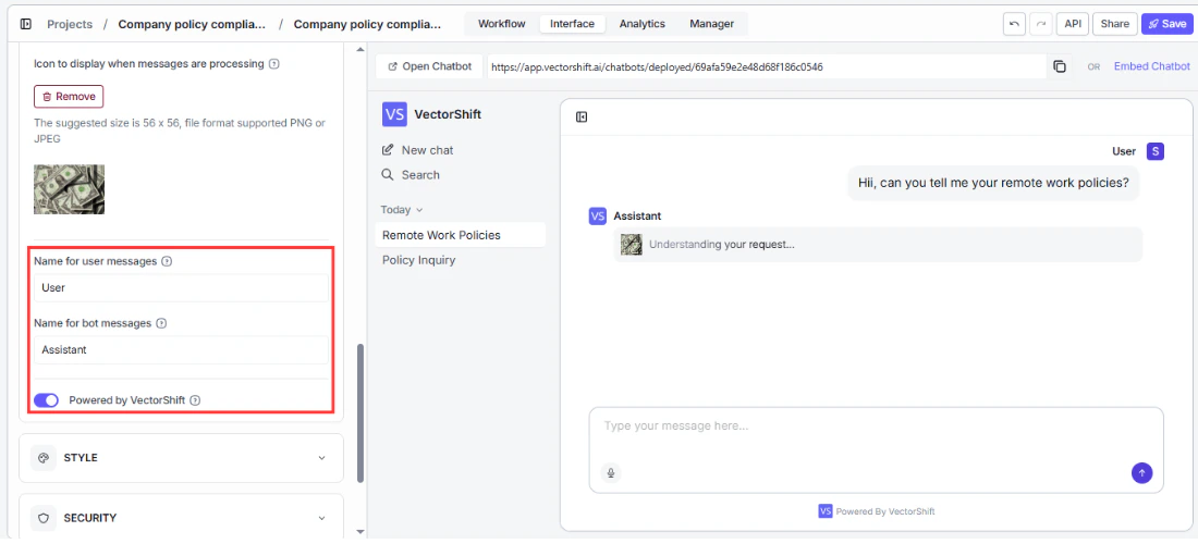 * **Powered by VectorShift** toggle controls whether the "Powered by VectorShift" branding appears in the footer. Enabled by default.
* **Bottom Bar Text** lets you add custom text to the footer, such as a tagline or legal notice.
* **Bottom Bar Redirect URL** makes the footer text clickable, linking to any URL you specify (your homepage, a support page, etc.).
* **Bottom Bar Icon URL** adds a small icon next to the footer text. Provide a URL to your logo or any other image.
## Step 8. Set custom avatars
The Avatars panel lets you replace the default VectorShift icons with your own images throughout the chat interface.
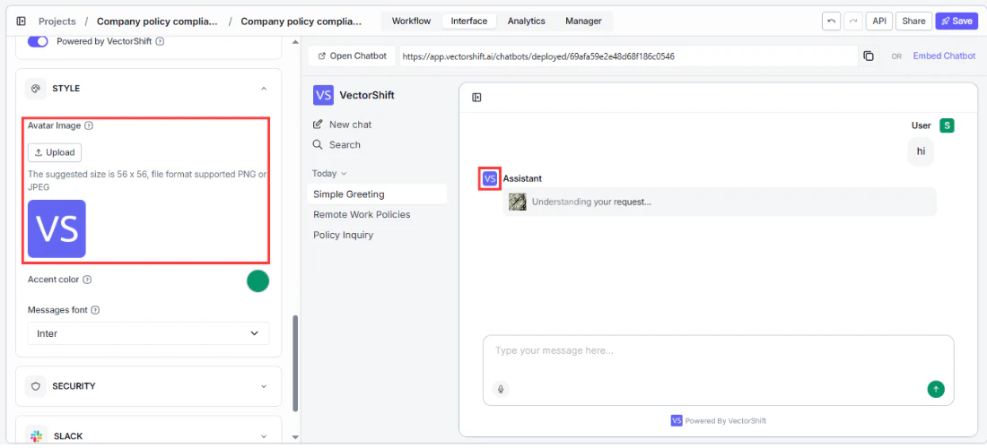
* **Assistant Image URL** sets the main avatar image for the chatbot. This appears in the welcome header and alongside bot messages.
* **Assistant Message Icon URL** sets a smaller icon that appears next to each bot message bubble. This can be different from the main assistant image.
* **Launcher URL** sets the icon used for the chatbot launcher button (relevant for embedded chatbots).
* **Response Loader Icon URL** customizes the icon shown while the bot is generating a response. You can use an animated GIF here for a loading effect.
## Embedded chatbot launcher settings
These settings let you customize the launcher button and its positioning for chatbots using the **Website Chatbot (Embedded)** template. Select the Embedded template to access them.
* **Powered by VectorShift** toggle controls whether the "Powered by VectorShift" branding appears in the footer. Enabled by default.
* **Bottom Bar Text** lets you add custom text to the footer, such as a tagline or legal notice.
* **Bottom Bar Redirect URL** makes the footer text clickable, linking to any URL you specify (your homepage, a support page, etc.).
* **Bottom Bar Icon URL** adds a small icon next to the footer text. Provide a URL to your logo or any other image.
## Step 8. Set custom avatars
The Avatars panel lets you replace the default VectorShift icons with your own images throughout the chat interface.
* **Assistant Image URL** sets the main avatar image for the chatbot. This appears in the welcome header and alongside bot messages.
* **Assistant Message Icon URL** sets a smaller icon that appears next to each bot message bubble. This can be different from the main assistant image.
* **Launcher URL** sets the icon used for the chatbot launcher button (relevant for embedded chatbots).
* **Response Loader Icon URL** customizes the icon shown while the bot is generating a response. You can use an animated GIF here for a loading effect.
## Embedded chatbot launcher settings
These settings let you customize the launcher button and its positioning for chatbots using the **Website Chatbot (Embedded)** template. Select the Embedded template to access them.
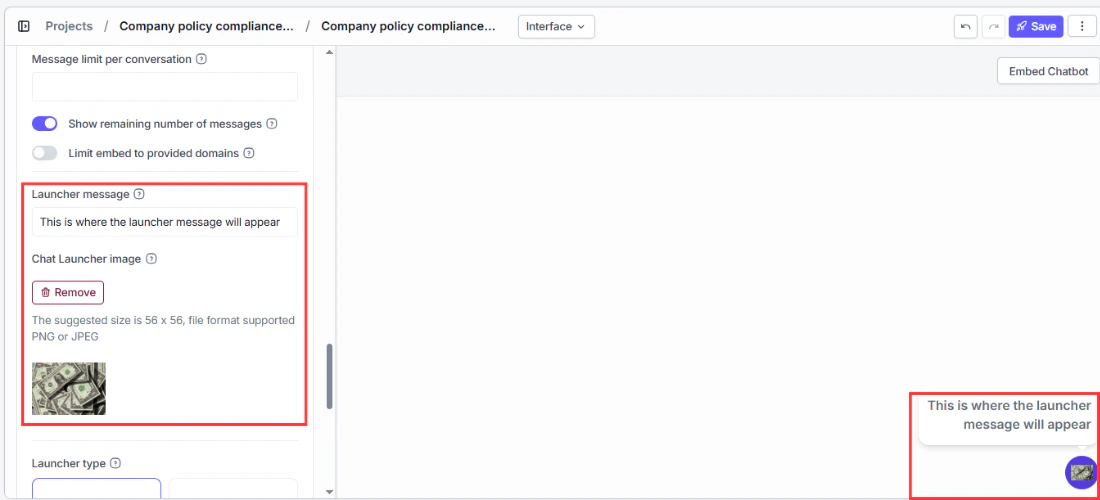 The launcher is the button that appears on your website and opens the chatbot when clicked.
* **Launcher variant** controls the launcher's appearance. Choose **Icon** to show just an icon, or **Icon + Text** to show an icon with a text label next to it.
* **Launcher text** is the label shown next to the launcher icon when the Icon + Text variant is selected. Defaults to `Chat`.
* **Launcher message** is a tooltip or prompt message shown near the launcher to encourage users to interact. Defaults to `Chat with us now!`.
* **Launcher image URL** lets you replace the default launcher icon with your own image.
* **Embed position** controls which corner of the screen the launcher appears in. Choose **Left** or **Right**. Defaults to `Right`.
* **Bottom spacing** sets the distance in pixels between the launcher and the bottom edge of the screen. Defaults to `10`.
* **Side spacing** sets the distance in pixels between the launcher and the left or right edge of the screen. Defaults to `10`.
## Conversation persistence (embedded only)
For embedded chatbots, conversation persistence controls whether returning users see their previous conversation when they revisit your website.
Persistence is enabled by default. The default duration is **1 week**, meaning a user who returns to your site within one week will pick up where they left off. After the persistence window expires, they start a fresh conversation.
You can configure the duration using any combination of a quantity and a time unit: minutes, hours, days, weeks, or months. You can also set it to **Infinite** to never expire — returning users will always pick up their previous conversation.
Longer persistence means returning users pick up where they left off, which is great for ongoing support conversations. Shorter persistence (or disabling it entirely) means each new browser session starts fresh, which works well for transactional use cases like quick lookups.
## Next steps
Your chatbot is now fully customized. Head to [Sharing and deploying](/platform/interfaces/chatbots/deploying) to choose how your users will access it.
Deploy via link, embed on a website, or connect to Slack, WhatsApp, and SMS
Track usage, review conversations, and export data
The launcher is the button that appears on your website and opens the chatbot when clicked.
* **Launcher variant** controls the launcher's appearance. Choose **Icon** to show just an icon, or **Icon + Text** to show an icon with a text label next to it.
* **Launcher text** is the label shown next to the launcher icon when the Icon + Text variant is selected. Defaults to `Chat`.
* **Launcher message** is a tooltip or prompt message shown near the launcher to encourage users to interact. Defaults to `Chat with us now!`.
* **Launcher image URL** lets you replace the default launcher icon with your own image.
* **Embed position** controls which corner of the screen the launcher appears in. Choose **Left** or **Right**. Defaults to `Right`.
* **Bottom spacing** sets the distance in pixels between the launcher and the bottom edge of the screen. Defaults to `10`.
* **Side spacing** sets the distance in pixels between the launcher and the left or right edge of the screen. Defaults to `10`.
## Conversation persistence (embedded only)
For embedded chatbots, conversation persistence controls whether returning users see their previous conversation when they revisit your website.
Persistence is enabled by default. The default duration is **1 week**, meaning a user who returns to your site within one week will pick up where they left off. After the persistence window expires, they start a fresh conversation.
You can configure the duration using any combination of a quantity and a time unit: minutes, hours, days, weeks, or months. You can also set it to **Infinite** to never expire — returning users will always pick up their previous conversation.
Longer persistence means returning users pick up where they left off, which is great for ongoing support conversations. Shorter persistence (or disabling it entirely) means each new browser session starts fresh, which works well for transactional use cases like quick lookups.
## Next steps
Your chatbot is now fully customized. Head to [Sharing and deploying](/platform/interfaces/chatbots/deploying) to choose how your users will access it.
Deploy via link, embed on a website, or connect to Slack, WhatsApp, and SMS
Track usage, review conversations, and export data