> ## Documentation Index
> Fetch the complete documentation index at: https://docs.vectorshift.ai/llms.txt
> Use this file to discover all available pages before exploring further.
# Talk — Card
> Send a rich card with image, title, description, and button in a conversational workflow.
Add it in Python with `pipeline.add(name="...").talk(...)`. See the SDK reference.
The Card node (a variant of the Talk node) sends a rich card component to the user at a specific step in a chatbot conversation. A card combines an image, title, description, and a clickable button into a single visual element. Use it to present structured information — for example, displaying a product listing with a purchase link, showing a service option with a booking button, or presenting a document summary with a download link.
## Core Functionality
* Sends a card component with image, title, description, and action button to the user
* The button supports Link action type, navigating the user to a specified URL when clicked
* Requires a Start node on the canvas to function
* Does not produce outputs — it is a display-only node
## Tool Inputs
* `Title` — Text. The card's title text.
* `Description` — Text. The card's description text.
* `Image` — Image. The card's header image.
* `Content` — Text. Additional content text for the card. Default: "This is content".
* `Button Name` — Text. The label displayed on the button. Default: "Submit".
* `Button URL` — Text. The URL to navigate to when the button is clicked. Default: "[https://vectorshift.ai/](https://vectorshift.ai/)".
* `Button Action Type` — The action to occur when the button is clicked. Default: "Link".
## Tool Outputs
The Card node has no outputs. It is a display-only node.
***
### Overview
In workflows, the Card node presents a visually rich component in the chat interface. It combines multiple pieces of information — an image, title, description, and call-to-action button — into a single card that users can interact with. This is ideal for presenting options, showcasing products, or providing structured summaries with actionable links.
### Use Cases
* Present investment fund options with fund name, description, performance chart, and a "Learn More" link
* Show product recommendations in an e-commerce chatbot with image, name, price, and a "Buy Now" button
* Display a document summary card with a title, brief description, and "Download PDF" button
* Present service tier options (Basic, Professional, Enterprise) with features and pricing links
* Show a contact card for a financial advisor with their photo, name, role, and a "Schedule Meeting" button
### How It Works
#### Step 1: Add a Start Node
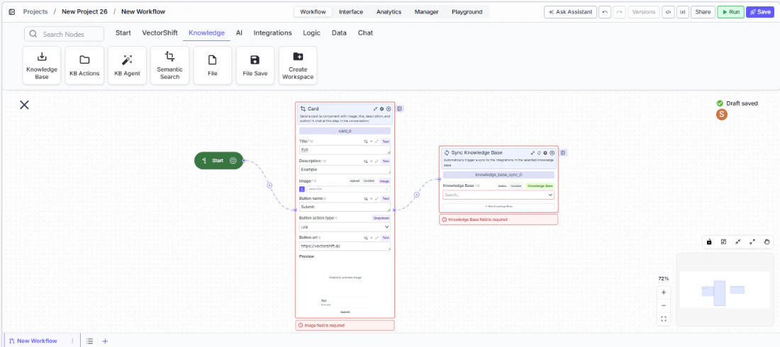
The Card node requires a Start node on the canvas.
#### Step 2: Add the Card Node
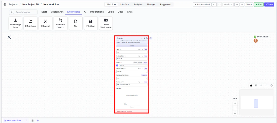
In the workflow canvas, click the **Chat** tab, click **Talk**, then select **Card** from the variant list.
 #### Step 3: Configure the Card Content
Fill in the card fields: `Title`, `Description`, `Image`, and `Content`. These can be static text or connected from upstream nodes via variables.
#### Step 3: Configure the Card Content
Fill in the card fields: `Title`, `Description`, `Image`, and `Content`. These can be static text or connected from upstream nodes via variables.
 #### Step 4: Configure the Button
Set the `Button Name` (label), `Button URL` (destination), and `Button Action Type` (default: Link). The button appears at the bottom of the card.
#### Step 5: Connect in the Flow
Place the Card node at the appropriate point in the conversation where the card should appear.
### Settings
| Setting | Type | Default | Description |
| -------------------- | ----- | -------------------------------------------------- | ------------------------------------------- |
| `Title` | Text | — | The card's title. |
| `Description` | Text | — | The card's description. |
| `Image` | Image | — | The card's header image. |
| `Content` | Text | This is content | Additional content text. |
| `Button Name` | Text | Submit | The button label. |
| `Button URL` | Text | [https://vectorshift.ai/](https://vectorshift.ai/) | The URL the button navigates to. |
| `Button Action Type` | Text | Link | The action type when the button is clicked. |
### Best Practices
* **Use dynamic content for personalized cards.** Connect upstream node outputs to the title, description, and image fields to generate cards tailored to each user's context.
* **Write action-oriented button labels.** Labels like "View Report" or "Book Meeting" are clearer than generic "Submit" or "Click Here".
* **Include an image for visual impact.** Cards with images are more engaging. Use relevant visuals like charts, product photos, or icons.
* **Keep descriptions concise.** Card descriptions should be 1-2 sentences that convey the key information at a glance.
* **Use multiple cards via Carousel.** If you need to present several options, consider using the Carousel variant instead of multiple Card nodes.
### Related Templates
Handles common customer inquiries and support tickets through conversational AI.
Assists banking customers with account inquiries, transactions, and product questions.
Provides real-time customer support directly embedded within a website interface.
Handles investor inquiries related to portfolios, statements, and fund performance.
### Common Issues
For help with common configuration issues, see the [Common Issues](/support) page.
#### Step 4: Configure the Button
Set the `Button Name` (label), `Button URL` (destination), and `Button Action Type` (default: Link). The button appears at the bottom of the card.
#### Step 5: Connect in the Flow
Place the Card node at the appropriate point in the conversation where the card should appear.
### Settings
| Setting | Type | Default | Description |
| -------------------- | ----- | -------------------------------------------------- | ------------------------------------------- |
| `Title` | Text | — | The card's title. |
| `Description` | Text | — | The card's description. |
| `Image` | Image | — | The card's header image. |
| `Content` | Text | This is content | Additional content text. |
| `Button Name` | Text | Submit | The button label. |
| `Button URL` | Text | [https://vectorshift.ai/](https://vectorshift.ai/) | The URL the button navigates to. |
| `Button Action Type` | Text | Link | The action type when the button is clicked. |
### Best Practices
* **Use dynamic content for personalized cards.** Connect upstream node outputs to the title, description, and image fields to generate cards tailored to each user's context.
* **Write action-oriented button labels.** Labels like "View Report" or "Book Meeting" are clearer than generic "Submit" or "Click Here".
* **Include an image for visual impact.** Cards with images are more engaging. Use relevant visuals like charts, product photos, or icons.
* **Keep descriptions concise.** Card descriptions should be 1-2 sentences that convey the key information at a glance.
* **Use multiple cards via Carousel.** If you need to present several options, consider using the Carousel variant instead of multiple Card nodes.
### Related Templates
Handles common customer inquiries and support tickets through conversational AI.
Assists banking customers with account inquiries, transactions, and product questions.
Provides real-time customer support directly embedded within a website interface.
Handles investor inquiries related to portfolios, statements, and fund performance.
### Common Issues
For help with common configuration issues, see the [Common Issues](/support) page.